I‘m ELLEN WANG,
FROM FIRST IDEA
TO FULL BRAND LAUNCH.

Creative Direction · Web Design · Social Media


Discover the Mood · Shape the Vision · Define the Look · Build the Brand
DESIGNING THE BRAND.
I begin by understanding the product, audience, market, and personality behind the brand.
Through visual research, competitor analysis, and moodboard development, I explore the colours, typography, imagery, and overall feeling that can help the brand stand out.
This gives every design decision a clear direction before the creative work begins.
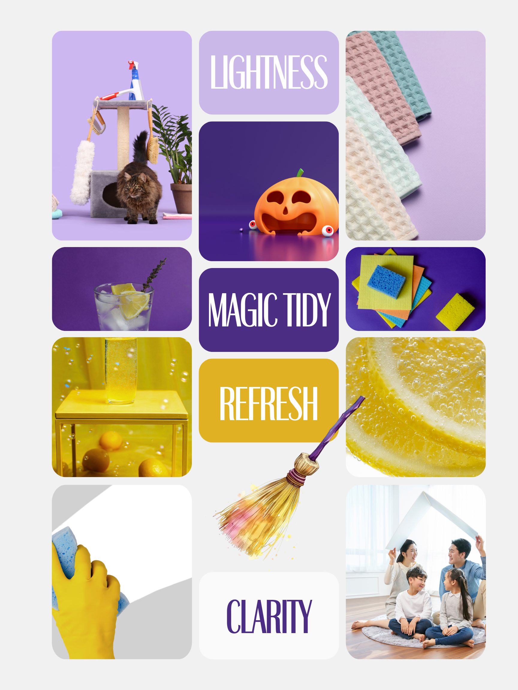
Magic Tidy is a Toronto-based home organization and cleaning company focused on creating calmer, lighter, and more functional living spaces. I developed a bright and approachable visual identity that transforms everyday cleaning into a refreshing, positive, and trustworthy brand experience.

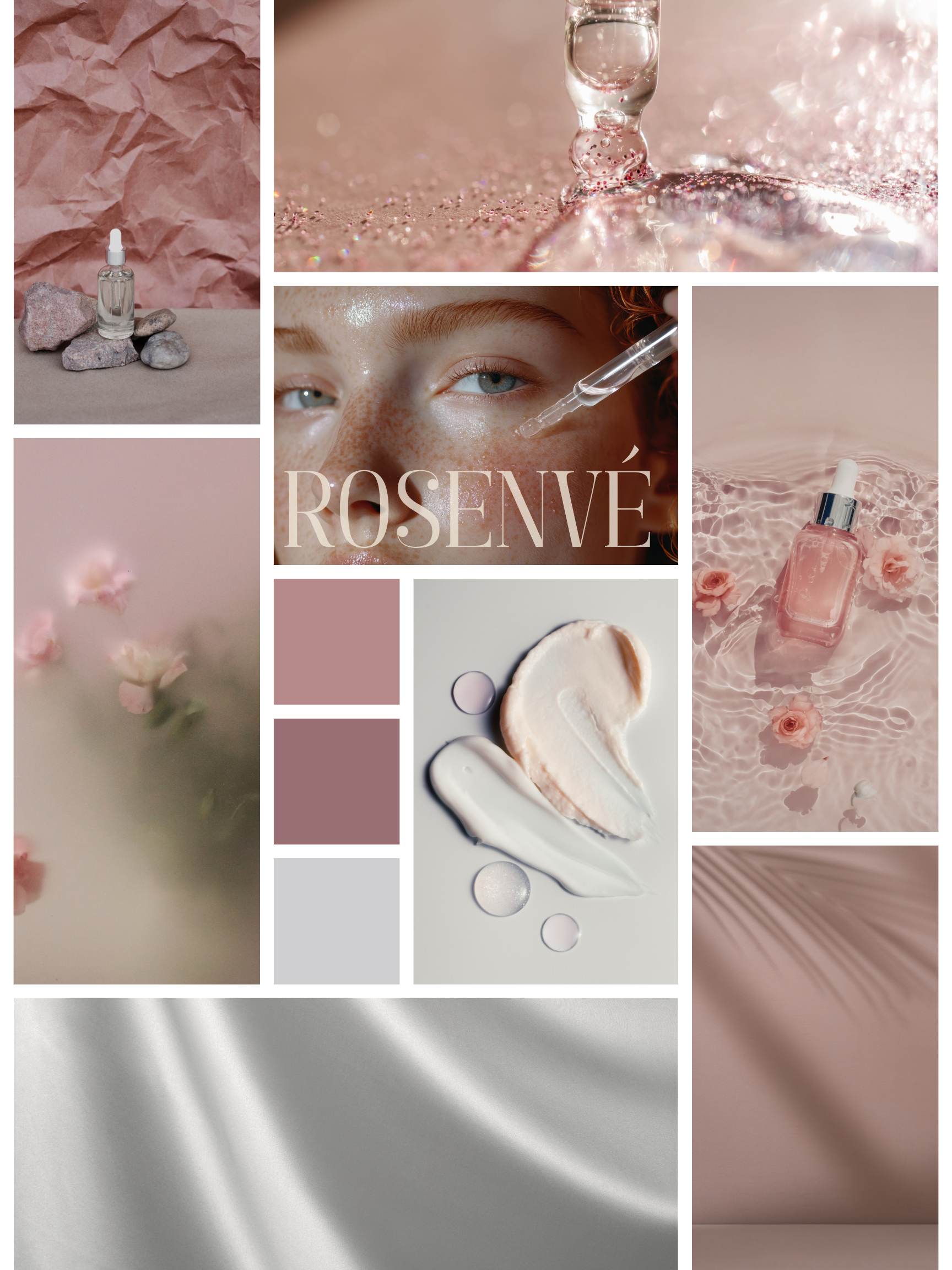
ROSENVÉ is a Vancouver-based skincare brand inspired by Swiss skincare innovation and modern cellular beauty. I developed a refined visual identity that balances science, elegance, and femininity—creating a consistent brand system across its packaging, website, social media, and marketing materials.

BRANDGUIDELINE DOWNLOAD
LOGO DESIGN

Floatin
(Dating Platform)
Rounded, playful letterforms with bubble-shaped "o"s echo the idea of effortless connection — drifting into something real. The soft, buoyant type conveys a relaxed, natural approach to meeting people.

Level Up
(Web Design Agent )
A simple arrow gradient from purple to blue points upward, symbolizing growth and breakthrough — taking a website from zero to one. "Level Up" is built right into the name, signaling progress and professionalism.

Magic Tidy
(Cleaning & Organizing)
A golden magic wand traces a sparkling trail above playful, hand-lettered type. The whimsical mark turns the chore of tidying into something magical — decluttering with a touch of wonder.

Rosenvé
(Rose-Scented Skincare)
A minimal line-drawn rose paired with an elegant serif wordmark. The muted rose-taupe palette feels refined and soft, evoking the delicacy of French perfumery and natural botanical care.
FROM VISUAL DIRECTION
TO DIGITAL EXPERIENCE.
I turn brand ideas into responsive, functional, and interactive websites that people can actually explore, use, and remember.
UI/UX Design · Responsive Development · Interactive Experience


SKINCARE E-COMMERCE
A refined bilingual e-commerce website created for a Vancouver skincare brand. I translated ROSENVÉ’s soft, science-inspired visual identity into a polished shopping experience that introduces its skincare philosophy, showcases its products, and supports online sales.
HOME ORGANIZATION & CLEANING
Share information on a previous project here to attract new clients. Provide a brief summary to help visitors understand the context and background of the work. Add details about why you created this project and what makes it significant.
REAL ESTATE & LEAD GENERATION
A professional real estate website designed to position the client as a trusted specialist in the Markham condo market. I created a clear, credibility-focused experience that presents local expertise, simplifies services for buyers and sellers, and encourages visitors to request a consultation.
PRIVATE DINING & EVENT BOOKING
An energetic, conversion-focused website created for a private hibachi catering company serving New York and surrounding areas. I designed the complete customer journey—from discovering the live dining experience and exploring the menu to submitting a detailed event booking request.